Scroll
Lets a group hold more than fits on screen: its children scroll into view with the crown or a drag, and anything outside its box is hidden.
About 4 minutes
Scroll turns an object into a window onto content that's bigger than the window itself. The object's box is the window. Its children can go past the edges, and the user brings them into view with the crown or a drag.
Setting one up
- Add a Group (Add Object ▸ Basics ▸ Group). Scroll only works on an object with no look of its own, not on an Image, Text or Shape.
- Size and place the group's box where the scrolling area should be. Often that's the whole screen.
- Add the Scroll component. A Clip is added with it, which is what hides what's outside the box.
- Put the objects to scroll under the group in the Hierarchy. They can run as far past the bottom (or the side) as you like.
Add a Layout to the same group to stack its children in a column, or fill them from a list. Showing a List builds one start to finish.
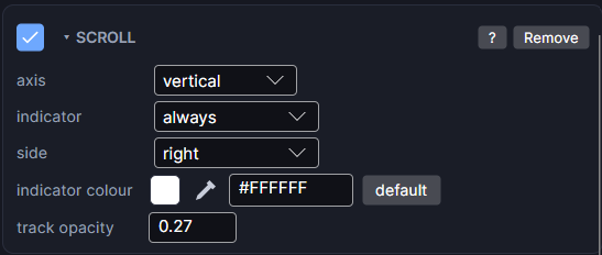
Anything outside the box is hidden
The group's Transform (its position and size) is the visible area. Every child, and every child of those children, is cut off at the edge of that box:
- Only the part inside the box is drawn. Scrolling slides more into it.
- A tap on a part that's hidden does nothing, so a button half out of view can only be pressed on the half you can see.
- The group itself never moves. Only what's inside it does.
- To round the corners of the visible area, raise the corner radius on the Clip component.
If an object vanishes when you put it under the group, it's sitting outside the group's box. Move it inside the box, or make the box bigger.
How far it scrolls
You don't set a length. The engine measures the children: it scrolls until the bottom edge of the lowest one comes into view, plus the bottom padding of a Layout if there is one. When everything already fits, nothing scrolls. In Preview, hidden objects (like empty rows of a list) don't count.
Settings
| Setting | What it does |
|---|---|
| axis | vertical (up and down, the usual on a watch), horizontal (side to side), or both. |
| indicator | When the scroll bar shows: always (the default), while scrolling, or off. |
| side | Which edge of the screen the scroll bar sits on: right or left. |
| indicator colour | The colour of the part that moves (white when left blank), and its opacity. |
| track opacity | How visible the faint rail behind it is, in the same colour. 0 hides the rail. |
The scroll bar settings only show when axis is vertical or both, because the scroll bar only tracks up and down scrolling.
The scroll bar
You don't build the scroll bar. Scroll draws it for you, the same one Wear OS apps use:
- It only appears when there's more to see than fits. When everything fits, there's no bar.
- It's a short curved bar on the edge of the round screen, centred on 3 o'clock (or 9 o'clock when side is left).
- The size of the moving part shows how much of the content is on screen. The less that fits, the smaller it gets. Its position shows how far down you are.
- While scrolling shows it when the screen opens and whenever it moves, then fades out about a second and a half after the scrolling stops.
- It shows in Preview and on the watch, not while you're editing in the Scene.
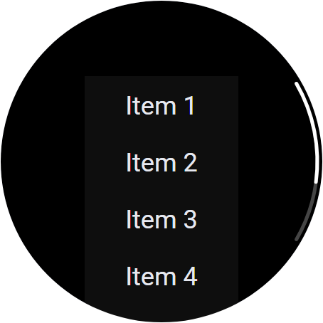
Google's review for Wear OS apps expects a scroll bar on screens that scroll, which is why always is the default. Off may fail review.
On Apple Watch, the watch draws its own scroll bar in the system style. Only off carries over. Side, colour and the fade are Wear OS only.
Scrolling with the crown and a drag
- Drag anywhere inside the box. A press only becomes a scroll after the finger moves a little, so tapping a button inside still works.
- The crown scrolls the first Scroll on the screen, unless something else on that screen uses the crown (a Rotary or a crown Control). Then the crown goes to that instead.
- In Preview, the mouse wheel is the crown. With axis set to both, hold Shift and use the wheel to scroll sideways.