← All tutorials
Progress Circle
A circular gauge in its own box: a ring, a filling pie wedge, or a liquid level.
About 5 minutes
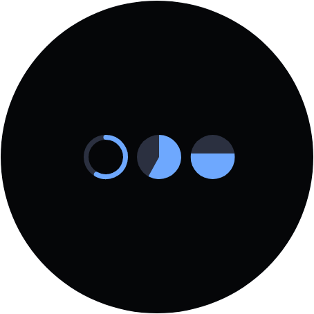
A circular gauge in its own box, filled by a live value. Three looks: a Ring, a Pie wedge that sweeps like a clock hand, or Liquid that rises like a tank filling up.
Settings
| Row | What it does |
|---|---|
| style | Ring, Pie or Liquid. |
| thickness | For Ring: stroke width, in pixels. |
| start angle / sweep | For Ring and Pie: where it starts (degrees clockwise from 3 o'clock; -90 is 12 o'clock) and how much of the circle it covers. |
| filled by | Which real watch value fills it: battery, steps, step goal percent, heart rate and other numeric values. (none) draws an empty track, which is handy while positioning it. |
| full at | The value that reads as completely full. 100 for a percentage, 10000 for a raw step count, 200 for heart rate. The most common reason a gauge looks wrong is this number. |
| shape | Rounded (round ends), Square (flat ends) or Blips (separate marks that light one at a time). |
| blips | For Blips: how many marks. 10 is handy, since each lit mark then means 10 percent. |
| gap | For Blips: how much of each mark's slot is left empty, which separates them. 0 is touching; 0.3 reads clearly at watch size. |
| taper | For Blips: how much bigger the last mark is than the first. 1 keeps them equal; 2 makes the last twice the first, for a tapered wedge. |
| track colour | The colour of the unfilled part. |
| colour | The filled part's colour. |
In the Scene it follows the Simulate tab; on the watch it reads the live value.
Every object also has the shared rows (position and size, ambient look, show when, Color Style and more), explained once in Settings Every Object Shares.