Bind Color
Bind Color changes an object's colour while its checks pass.
About 1 minutes
Bind Color changes an object's colour while its checks pass. On a Text it's the text colour, on an Image the tint, on a Shape the fill. HP text turning red when it's low is the classic use.
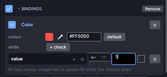
Settings
Add it from Add Component ▸ Bind Color, or with + binding: Color on an existing Bindings card.
| Setting | What it does |
|---|---|
| colour | The colour to use while the checks pass. Starts as red (#FF5050). |
| while | The checks. With none, it reads always and the colour always applies. |
| all of these / any of these | (two or more checks) Whether every check must pass, or just one. |
| + check | Adds a check row. Each row has its own ✕ to remove it. |
| On/off checkbox | Turns this binding off without removing it. |
The checks work the same way as in Bind Visible.
Good to know
- When the checks fail, the object goes back to its own colour.
- Only one Bind Color fits on an object. For three states (green, yellow, red), put the normal colour on the object itself and use the binding for the one state that matters most.
- Only the colour is used. To fade, use Bind Opacity to fade.
- Works in Game and App projects on both watches. Not offered on watch faces.