← All tutorials
Progress Bar
A straight (or gently curved) gauge filled by a live watch value, horizontal or vertical.
About 4 minutes
A straight gauge that fills with a live value, like a battery bar or a step goal bar.
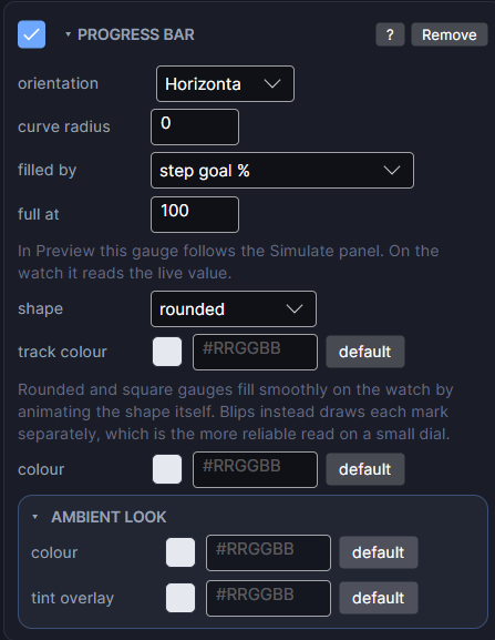
Settings
| Row | What it does |
|---|---|
| orientation | Horizontal fills left to right, Vertical fills bottom to top. |
| curve radius | Bends the bar into a gentle arc, in pixels. 0 keeps it straight. A bigger radius is flatter. Horizontal bars bow upward and vertical ones to the right; rotate the object to bend another way. Not available on the Blips shape. |
| filled by | Which real watch value fills it: battery, steps, step goal percent, heart rate and other numeric values. (none) draws an empty track, which is handy while positioning it. |
| full at | The value that reads as completely full. 100 for a percentage, 10000 for a raw step count, 200 for heart rate. The most common reason a gauge looks wrong is this number. |
| shape | Rounded (round ends), Square (flat ends) or Blips (separate marks that light one at a time). |
| blips | For Blips: how many marks. 10 is handy, since each lit mark then means 10 percent. |
| gap | For Blips: how much of each mark's slot is left empty, which separates them. 0 is touching; 0.3 reads clearly at watch size. |
| taper | For Blips: how much bigger the last mark is than the first. 1 keeps them equal; 2 makes the last twice the first, for a tapered wedge. |
| track colour | The colour of the unfilled part. |
| colour | The filled part's colour. |
The box (Size) sets the bar's length and thickness. In the Scene it follows the Simulate tab.
Every object also has the shared rows (position and size, ambient look, show when, Color Style and more), explained once in Settings Every Object Shares.