← All tutorials
Battery Level
The watch's battery level as text, a ring, a bar or a circle. Always the real battery, never reassignable.
About 3 minutes
Shows the watch's battery level. It reads the battery directly, not through a complication slot, so the wearer can't repoint it and it doesn't use one of the face's eight slots.
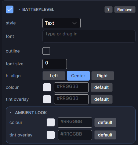
Settings
| Row | What it does |
|---|---|
| style | Text (for example "82%"), or Ring, Bar or Circle: the same gauges as the Progress objects, filled by the battery level. |
| font / font size | Typeface and size. Size 0 means automatic. |
| h. align / v. align | Where the reading sits in its box. |
| colour | The colour of the text or gauge. |
For the Ring, Bar and Circle styles, the gauge shape rows (shape, blips, gap, taper, track colour) work like they do on Progress Arc.
Set a test level in the Simulate tab to see how it looks at 5 percent. To turn it red when low, use dynamic tint on an icon beside it (see the shared settings).
Every object also has the shared rows (position and size, ambient look, show when, Color Style and more), explained once in Settings Every Object Shares.