← All tutorials
Progress Arc
A ring gauge you place and size anywhere, filled by a live watch value like battery, steps or heart rate.
About 4 minutes
A ring (donut) gauge that fills with a live value: battery, steps toward the goal, heart rate. Place and size it anywhere; its box sets where the ring sits.
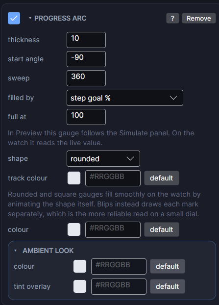
Settings
| Row | What it does |
|---|---|
| thickness | The ring's stroke width, in pixels. |
| start angle | Where the ring begins, in degrees clockwise from 3 o'clock. -90 (the default) is 12 o'clock. |
| sweep | How much of the circle it covers. 360 is a full ring, 270 three quarters, 180 a half. The fill is a share of this sweep. |
| filled by | Which real watch value fills it: battery, steps, step goal percent, heart rate and other numeric values. (none) draws an empty track, which is handy while positioning it. |
| full at | The value that reads as completely full. 100 for a percentage, 10000 for a raw step count, 200 for heart rate. The most common reason a gauge looks wrong is this number. |
| shape | Rounded (round ends), Square (flat ends) or Blips (separate marks that light one at a time). |
| blips | For Blips: how many marks. 10 is handy, since each lit mark then means 10 percent. |
| gap | For Blips: how much of each mark's slot is left empty, which separates them. 0 is touching; 0.3 reads clearly at watch size. |
| taper | For Blips: how much bigger the last mark is than the first. 1 keeps them equal; 2 makes the last twice the first, for a tapered wedge. |
| track colour | The colour of the unfilled part. |
| colour | The filled part's colour. |
In the Scene the gauge follows the Simulate tab; on the watch it reads the live value. Rounded and Square gauges fill smoothly; Blips draws each mark separately, which reads more reliably on a small dial.
Every object also has the shared rows (position and size, ambient look, show when, Color Style and more), explained once in Settings Every Object Shares.